As part of my Production Lab project I aimed to create a sample feature layout from scratch in Adobe InDesign. There were several stages which guided this process; research and inspiration, tutorials, practical work, feedback, and responding to that feedback.
Research
Firstly, I used examples to help guide how I wanted to layout my feature aesthetically. I used ‘inspiration curation’ websites such as Pinterest and Designspiration. I blogged about my initial ideas in this post.
I read ‘Basics of Design 02: Layout’ by Ambrose and Harris, and wrote a literature review on it. This text taught me how to grab the attention of the reader using text and imagery.
I found online tutorials which would be beneficial to designing magazine covers. However, the tutorial which I ended up selecting for my features layout was a PDF spread, ‘Design a multi-page mag feature‘ by Jo Gulliver. This was pretty much my only practical guide to creating my layout.
Research influenced my design in the following ways:
- ‘Basics of Design 02: Layout’ introduced me to the idea of pacing a reader; using text and imagery to guide how fast a reader consumes your copy.
- The introduction of the ‘baseline grid’ in ‘Basics of Design 02: Layout’ and ‘Design a multi-page mag feature’ was key to the development of my magazine feature layout.
- ‘Come Home’ magazine vol. 25 uses an image focussed home tour layout to pace the reader and create interest.
- The large portrait images in ‘Swedish Elle Interior’ magazine apartment feature layout inspired the title page for this feature.
- Although this image is a front cover, ‘Make Shift’ magazine cover inspired me with the little pointed ‘tab’ design on the corner for text. This inspired the coloured ‘Meet The Blogger’ rounded ‘tab’ on the second page of this feature.
Following a tutorial
I used ‘Design a multi-page mag feature‘ to instruct the design of my layout. This tutorial PDF was more instructional on separate elements of creating a page than actually designing a specific layout. This is why research into which layouts I would like to try and create was so important – I would not have the same exact basic design guidance as I did in my cover layout.
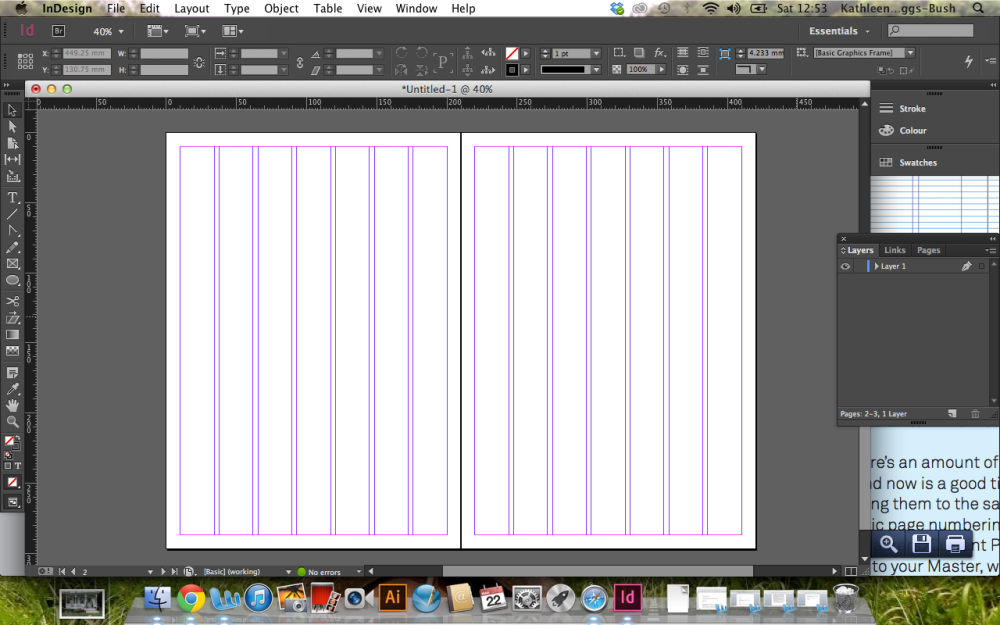
I built my grid based on my chosen body font, Helvectia Nueve in 9.5 pt, and added margins and columns as instructed in the tutorial.

removing a light fitting from an image in Picasa
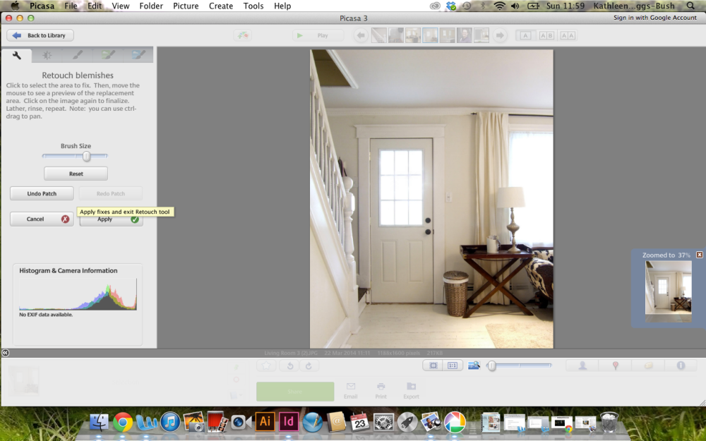
I made adjustments to my images as I went. As I have little prior photoshop knowledge, I used the free programme ‘Picasa’ to edit my photographs.

I placed the body text into my baseline grid. I used text frames (two columns for body, one column for caption copy) to insert this text and organise it.
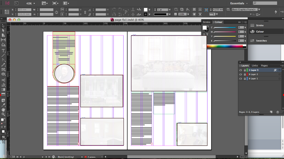
I added a large title and subheading text. I also began to play around with the layout of images.
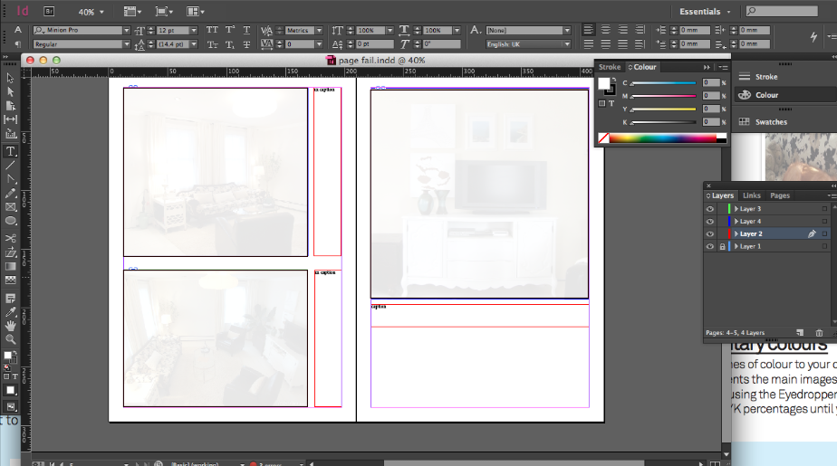
I was inspired by the tutorial to add quotes to stand out and gain the reader’s interest in the main feature. This will also help with ‘pacing’ the article. I chose to have some pages which were more image focussed.
Like in the tutorial, I chose the ‘opening page’ of my spread to be a strong image.
I also used a bit of my own initiative. In my FEED Graphic Design classes I have been learning how to work Illustrator to create picture logos. These illustrative skills are transferrable to InDesign. I used these basic skills to create the ‘Meet The Blogger’ tab in the left corner of the second page.
Feedback from industry art designer and magazine editor
I gained feedback from the art designer and editor at the homes magazine where I work as the editorial intern, which I have outlined below:
- Justified text takes the subs team ages to read. It’s a personal preference, but it’s often used in brochures so probably shouldn’t be used in magazines.
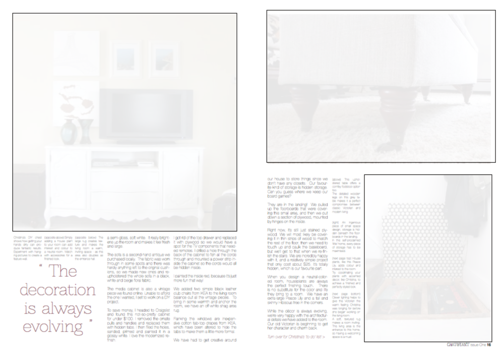
- The ‘before’ image should be smaller, and could be ‘clipped’ in a more adventurous fashion.
- Make less interesting pictures smaller – such as the image of the footstool legs.
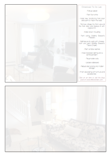
- Give the feature the aesthetic of a ‘project scrapbook’ – using grid paper backgrounds for the ‘to do list’ and the ‘before’ image.
- Make captions a different font/weight to differentiate them from the body copy.
- On the opening page: I should make the page numbers a more interesting font, and edit out the light switch in the image.
- On the first two page spread: I should make the quote strike bolder and give colour to the ‘for more articles’ tagline.
- On the second two page spread: Experiment with photo sizes and move photographs around – or find alternative images.
Feedback from Graphic Design Certificate tutor
I’m currently taking evening classes to complete the FEED certificate in Graphic Design. The course is taught by Rob Hildreth, an industry professional graphic designer, who has also kindly given me feedback on my project in an annotated workbook document, which I have summarised below:
- Opening page: Go BIG on the ‘Little Victorian’ title, make it bold and stand out.
- First double page spread: Give colour to the title and bold, perhaps swap the tab and title around, pull out the quotes with. bolder, brighter colours, captions can be on the picture too!
- Second double page spread: keep captions away from body copy, experiment with bleeding images off the page.
- Final page: Try a block design behind the ‘to do list’.
Modifying my design with feedback
- In the first page of my feature, I made the ‘Little Victorian’ text larger and put it in a semi-transparent white box to make it stand out.
- I lined up the author with the title.
- I made the page number the same font as my body copy.
- I also edited out the light switch in Picasa!
- I aligned the text to the left and made the body copy bolder and separated it from my body copy.
- Although you can’t see well in this image, I placed the ‘before image’ (bottom right) on a grid paper background with ‘before’ text in the top left corner.
- I made the text in the ‘Meet The Blogger’ tab white to differentiate it from body copy.
- I also made the ‘click here’ text a different colour from the body copy.
- I replaced the footstool legs image (top right) with an image of the living room which the editor at my internship preferred.
- Again, I aligned my text to the left and made my captions bold.
- I replaced the bottom image, the one of the living room used in the previous page, with another image from the same house. I replaced the captions on the previous page accordingly.
- I increased the bold on the title of the ‘to do list’. I also placed it on a graph paper background.
Final feedback
The graphic designers at my internship thought that they layout had improved a lot! I’m happy with this final spread as I feel that now the images have been more appropriately chosen and the graph paper adds character and interest, reflecting the ‘project diary’ theme of this feature.





One Comment Add yours